Hey folks!
This is a less formal post, and is basically just me venting a bit about the way the Pathfinder adventures tend to be written. I've been running Pathfinder 2e for years now. In that time, I've run a conversion of 1e's Quest for the Everflame, The Fall of Plaguestone, the Beginner Box, Abomination Vaults, the first three and a half books of Strength of Thousands, and the first book and a half of Stolen Fate.
I'll be using Strength of Thousands Book 4: Secrets of the Temple City as my example here (spoilers!), because that's the module I'm running right now, but all the adventures above (and several others that I've just idly flipped through) share several pretty frustrating tendencies. No shade to the individual writers/designers (see my praise of chapter 2 here), it's clearly a style guide problem (or a knock on effect of being paid by the word), not an individual writer problem, and their release schedule adds its own challenges.
It's also an industry-wide problem - I'm not aware of a publisher as large as Paizo that doesn't have similar problems! WotC is definitely worse, as showcased by one of the most scathing reviews I've ever read - after years of running 5e, I've just given up hope in making it worth playing, whereas I believe strongly in PF2 as a game and want its modules to be better!
Ultimately, the problem boils down to modules being designed to be read rather than used, which can lead to some frustrating moments as a GM. So, today we'll be walking through some of that and contrasting Paizo's approach with that of smaller RPGs.
Telling, Not Showing
There's a strong tendency towards explicating backstory over writing a useable room description.
Consider the following passage (page 34):
A5. Meeting Rooms
These two side chambers each contain a large stone table and pair of stone benches placed on either side. The people of Mzali-Jimbuani used the tables to serve food during celebrations.
It's, fine? It's short on purpose, to save space for more interesting stuff, but reading through it I can't help but wonder: how will the players know that it was used to serve food during celebrations? Consider this alternative:
A5. Meeting Rooms
These two side chambers each contain a large stone table and pair of stone benches placed on either side. Atop the table are several cracked and shattered earthenware plates, cups, and serving trays.
Basically the same information, but written in a way that communicates the information to the players, not just to the GM. The first version basically tells the GM to make up the details on the spot, and for simple cases like this that's not so hard! I basically improv'd the second text in my description, but I wouldn't've been able to do that comfortably when I was just getting started as a GM. If you don't think this description is clear enough for the GM, you can change the title to "Feast Halls" or similar.
Consider a slightly more complicated room:
A2. Prayer Chambers
This large chamber contains several stone benches. A number of engravings and symbols are carved into the wall, most of them pertaining to the sun or moon. A set of stone doors lead in and out of the far ends of this room.
When not partaking in any ceremonies, the people of Mzali-Jimbuani would come to these two chambers to pray. The symbols are meant to be generic, tied more to the theme of the shrine than of any particular god, as the people were free to worship as they wished within these walls.
Treasure: A follower of Dajermube lost a set of prayer beads in the western prayer chamber as they fled the shrine during the Council of Mwanyisa’s attack. These beads fell beneath a bench and are now covered with dust and cobwebs, making them difficult to spot. A character Searching the western prayer chamber discovers the greater holy prayer beads with a successful DC 25 Perception check.
Some of this information feels unnecessary, like "the people of Mzali-Jimbuani would come to these two chambers to pray". It's called the "Prayer Chambers", and it's a bunch of pews in an isolated room surrounded by religious iconography. Of course people came here to pray!
The line "A follower of Dajermube lost a set of prayer beads in the western prayer chamber as they fled the shrine during the Council of Mwanyisa’s attack." is wild to me, however. Once again, I am forced to ask, how can the players possibly learn this? It makes the section read better, because the reader knows the backstory of how this place got like this. But as a GM, it's basically just wasted space that I have to skip over in order to find the actually useful information or a prompt to invent my own room descriptions (which ruins the point of having room descriptions).
There is one case where having info like this is helpful, and that's if the players consult the spirits or similar - having a sense of what the ghosts of worshippers long dead at the hands of Walkena's agents is totally valid! But that's covered by the text at the top of the section (page 32), so they don't really need to get into it in each individual room. Regardless, if the backstory is ever really important for the players to know, consider a letter or journal instead! Some Paizo adventurers do this, to be fair, but fewer and less often than I'd like.
Consider this revision:
A2. Prayer Chambers
This large chamber contains several stone benches, littered with dirt and rubble. A number of engravings and symbols are carved into the wall, most of them pertaining to the sun or moon. A set of stone doors lead in and out of the far ends of this room.
Examine the Carvings: The engravings are fairly generic, and cracked with time. (West Chamber) The cycles of the moon, glittering amongst the stars. (East Chamber) Images of the sun's rise and setting, of the life it brings to the plants and the workers toiling under its warmth.
Search the Benches: (West Chamber) Underneath the dust and cobwebs are incredibly preserved white beads (greater holy prayer beads), stuck with ancient matted blood to a skeletal finger and thumb. (East Chamber) Crushed under the rubble are splinters of bone and a broken spear head.
Isn't that better? It's more evocative, you still get a sense of the history but in a way that can be communicated to the players, and there's way more specific details to share with the players despite being shorter! It's also broken up better by formatting (which we'll get to more later).
Even if you don't like my writing style, which is fair - I'm far from a professional writer. Even if you think this tone is a little too gritty, I'm sure that can be toned down. Even if you like Perception checks to find stuff (though a DC 25 is basically automatic at Level 13 anyway) instead of letting players who look for Hidden things just find them (my OSR is showing).
One version tells the story to the GM, and expects them to either be happy knowing it or make up their own details, and the other gives them the tools they need to share that story with the players.
Walls of Text
Evocative writing aside, a common frustration when running Paizo adventures is sifting through the wall of text to find the specific piece of information I'm looking for in a given moment. Often, it feels like it's in the last place I look - if I read from the beginning, it's at the end. If I skip to the middle, it was in the section before. Consider this intro section (pages 32-33):
FEATURES OF THE SHRINE
Brownish-yellow sandstone makes up the shrine. The interior walls feature eclipse imagery and local symbology representing eclipses. These symbols are spaced at regular intervals along the shrine’s walls and are magically enchanted to glow, filling the shrine with dim light at all times. Unless otherwise noted, the ceilings of the aboveground shrine are 30 feet tall, or 20 feet tall in the temple below. The shrine’s typical entrance is area A1, with access to the temple below via the staircases in area A7. The massive opening in the side of the temple in area A22 allows access into the temple’s bottom floor, but the opening is anything but safe, as noted in the area’s entry.
The temple features a system of magical doors that open to exposure to direct sunlight or moonlight, or to similar magic, as marked on the map. These doors are made of magically reinforced stone (Hardness 42, HP 168, BT 84) and have no discernible handle or way to open them. The residents of the shrine typically used a pair of magical lanterns—one that produces light similar to sunlight, and another that produces light similar to moonlight—to open these doors. The twilight lantern is currently in area A19 and the midday lantern is in area A23. Each door listed on the map is actually two thin doors standing side by side, one keyed to sunlight and the other to moonlight. A character capable of casting a spell that produces light similar to sunlight or moonlight (such as sunburst, moonburst, or the moon domain spell moonbeam) can Cast the Spell directly on the door to open it. A character with the Trick Magic Item feat can get the door open with a successful DC 40 Religion check. Regardless of how the door is opened, it remains open for 1 minute before closing on its own, though a creature can push the door closed at any time with an Interact action.
The map of the Shrine of the Eclipse appears on page 30.
It's genuinely a very fun concept, but the details are so buried! You basically have to read through the paragraph every time to find the info you're looking for.
On the other end of the extreme are Old School Essentials dungeons like Hole in the Oak (a personal favorite of mine). Take a look at their Drivethru RPG preview pages: they bold important words that the GMs eyes should jump to, and include clarifying info that would be immediately obvious (in parentheses). They put information buried behind interaction into bullet points, and use multiple types of headers to separate out different sections. I've written adventures in this style, though not for OSE, and it's definitely a little too sparse for my tastes, but I think there's a lot to learn there.
Consider this revision to our original intro:
FEATURES OF THE SHRINE
Walls: Brownish-yellow sandstone makes up the shrine. The interior walls on the lower levels feature eclipse imagery, evenly spaced along the walls magically enchanted to glow. Light: The upper level lets in natural light through its glass ceiling. The lower levels are lit with dim light from the glowing symbols. Ceilings: Unless otherwise noted, the ceilings of the aboveground shrine are 30 feet tall, or 20 feet tall in the temple below.
Entrances: The shrine’s typical entrance is area A1, with access to the temple below via the staircases in area A7. The massive opening in the side of the temple in area A22 allows access into the temple’s bottom floor, but the opening is anything but safe, as noted in the area’s entry.
Doors: The doors are made of thin but magically reinforced stone (Hardness 42, HP 168, BT 84) and have no discernible handle or way to open them. They cannot be opened by normal means (see below), but if opened they close automatically after 1 minute (though a creature can push it closed early).
Opening the Doors: The doors open to exposure to direct sunlight or moonlight, or to similar magic, as marked on the map. The residents of the shrine typically used a pair of magical lanterns to open the doors — the twilight lantern currently in A19 produces light similar to moonlight, and the midday lantern in A23 produces light similar to sunlight. Spells that cast light similar to sun or moon light (such as sunburst, moonburst, or the moon domain spell moonbeam) can also open the doors, as can a character with the Trick Magic Item feat who succeeds on a DC 40 Religion check.
The map of the Shrine of the Eclipse appears on page 30.
It's almost exactly the same length, and mostly the same text, but it's so much easier to navigate! All I did was re-order things slightly, separate the sections out a bit more, and bold the key words that a GM might need to look for quickly. There's more you could do if you wanted, but even these simple changes make a huge difference.
Page Layout
Another common problem is that information is often split between different spreads. For folks who don't think in book layout terms, a spread is basically 2 pages, left to right. When you're running with a book at the table, which is my preferred way to run (even when I run on foundry, I usually read things in the book because it's 1. prettier and 2. easier to navigate), it's how much of the book you can see at once.
I'm personally not a huge fan of information being split across columns, let alone across pages. But I think it is eminently reasonably to expect that at the very least it will not be split across spreads. The GM should at a glance have all the relevant info about a room key.
There are a few examples in Secrets of the Temple City that I can sort of get? In chapter 2, there are several places where treasure spills over onto the next spread (with the Grave Karinas and Biloko), for example. The info on the old sun gods in the golem fight spilling over is definitely worse, however, because it makes it easy for the GM to miss that very key info that serves as a really clever way to clue the players into the golems weaknesses so they might exploit them! (I actually did this when I was running it, forgetting to activate the statues until round 2 because it was on the next page.)
And outside of chapter 2, there are several worse examples, where even stat blocks spill over! In chapter 1 the reborn sun warrior and several negotiation stat blocks (Sihar, Themba, and Worknesh), and in chapter 3 the Gold Defenders and Living Sun Spires. The idea of running a combat while flipping back and forth between pages is exhausting to think about - I'm very glad I'm running this AP on Foundry, but I had to deal with this when running in person and it sucks - and it would not be hard to break those out into a sidebar and have the main text work around them, or even put them at the end (like they do with many other stat blocks!). Not that it's great when a room description (or description of what creatures in a room do / etc.) spills over between spreads either, of course.
Consider this alternative formatting from Aberrant Reflections, a really neat OSR puzzle dungeon and one of my favorite examples of dungeon layout:
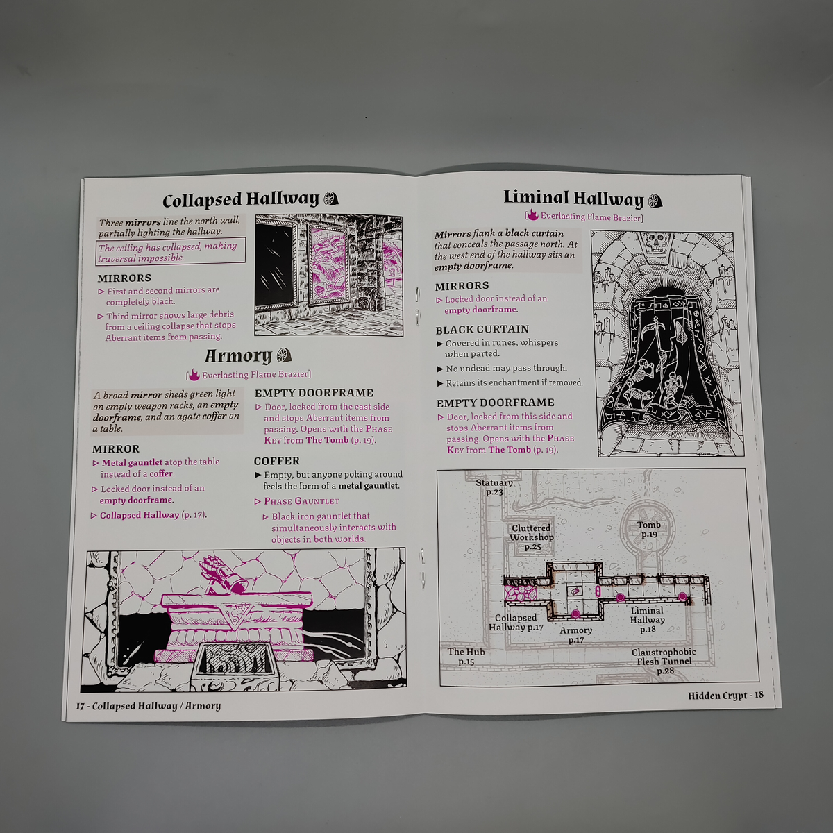 |
| From spearwitch.com |
Obviously, the text is much more concise, but that's ultimately down to taste - less text makes it easier for the GM to process quickly, but more text (when that text is effective and useful) gives them more to work with in total. It's also digest sized instead of full sized, though, so the principles can still transfer.
The big takeaway is that this one spread gives you everything that you need to run these three rooms without flipping the page! It even gives a little mini-map that shows where you are in the dungeon and what rooms are nearby, though I'd consider that extra credit and not strictly necessary. Each room is visually contained in a little block, the headers and formatting all work together to highlight the important info and make exploring the room really easy to run, and there's a really excellent use of visuals to help clarify some of the more complicated situations.
What if a room is too complicated to fit on one page?
 |
| From itch.io |
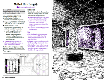
It takes work, it takes time, and it takes a willingness to fit the text to the space and not always the other way around, but but the effect is tremendously helpful to the GM.
Addendum: Paying by the Word
I am fully aware that paying writers by the word is standard for RPGs, but I hate it! It incentivizes verbosity over efficiency, which contributes to all the problems above:
- Telling, Not Showing is easy to justify when you get paid by the word regardless of how useful those words are to the GM.
- Walls of Text will make you more money than more efficient word choice.
- Page Layout is harder with bigger chunks of text (often, to make everything fit in a spread, page, or column requires judiciously cutting the text to make it fit).
My partner used to work in publishing, and explained when I was ranting about this that physical print newspapers used to pay by the article, and have specific inch requirements for their articles. They were also incentivized to put the most important information up front, in case something needed to be cut. That honestly sounds like a better model for RPG books to me! Though maybe we organize things by the column/page/spread rather than inch.
Conclusion
Paizo modules are designed to be read, rather than used at the table, and that can be tremendously difficult for GMs who don't want to highlight their gorgeous books or don't have time to basically rewrite everything (or even an outline) in an easier to reference manner. While I recognize that many aspects of this problem stem from underlying business practices that would be difficult to change - a tight release schedule, paying by the word, and industry standards more broadly - a lot of it seems to be very clearly fixable with a better style guide.
In fact, I think there are several things that Paizo could likely start doing right now to make modules easier for GMs to use at the table:
- Break up walls of text with formatting to make things easier to read.
- Challenge writers to find ways to show information to the players (other than "this NPC tells you all this stuff"), rather than just writing out a bunch of backstory.
- Pay attention to spreads, potentially cutting some text here or there or resizing art to keep everything about a topic in the GMs view at once.
And here are some things that I think are probably bigger changes than they can/will reasonably make in the short term, but that I think would be neat:
- Pay attention to pages/columns, and cut/move text or resize art to keep everything about a specific topic organized accordingly (I think it should always be possible to keep things on the same page, and usually to keep things from spilling over between columns).
- Format stat blocks as, actual stat blocks (like 5e) so that you don't have to include them inline, but can move them around to wherever they fit best and have the text spill around it.
At the end of the day, Paizo modules are pretty good! Sometimes they have weird subsystems that don't work well, sometimes they're a bit too linear for my tastes (arguably a question of space, though the verbosity of some sections makes me question that), and I think some of the formatting could be better focused to help GMs at the table, but for something that gets cranked out month after month the quality is truly impressive. Criticism is a gift, and I am giving it both to hopefully help Paizo, and to organize my thoughts for potential personal projects.
What things do you either love or hate about Paizo modules?


I think there's a lot of valid criticism here! I can't promise that we'll immediately change the format of our adventures going forward, but I know that I'm excited to try to implement some of your suggestions the next time I write an adventure. Thanks for the feedback!
ReplyDeleteThanks so much for taking a look! I love your work (we've been having SUCH a blast with SoT especially), and really appreciate how open all of you at Paizo are to feedback and engaging with the community!
DeleteGood blog, going to check out some of your previous stuff now. Also _casts eyes towards the awesome Luis Loza_ looking forward to Pathfinder adventures potentially being even better than they already are!
ReplyDelete